
Farms for
City Children
BRANDING / IDENTITY / PROPOSAL / DUO TEAM PROJECT
MY ROLE: colour scheme, strategy, brand touchpoints
How do you encourage disadvantaged inner-city kids to engage more with nature?
The Challenge
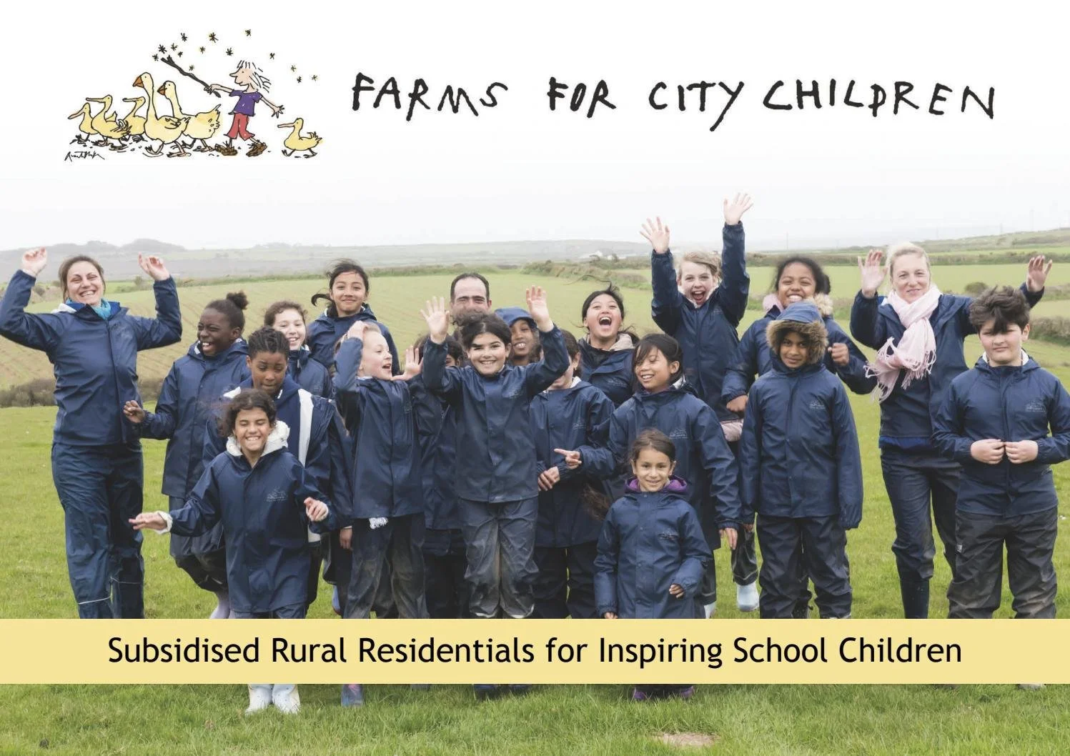
Founded in 1976, the charity offers inner city children residential visits to experience life on a farm, where they work together learning to garden, take care of animals and live comfortably alongisde nature. They wanted a rebrand that could transfer easily across platforms, link with their rich history and be appealing to children between 8 - 14.


The Solution
A bold and inviting brand identity that is modern and applicable to multiple touchpoints. To pay respect to their rich history, the colour scheme takes inspiration from the county flags where each farm is located.


“It has been an absolute pleasure to have worked with the Arts University Bournemouth students this year, they have shown great maturity, passion, and insight into our brand and how a redesign could work in the real world. The level of detail and thought into the touch points was better than I have seen from several design agencies with years of experience. Thank you from everyone here at Farms for City Children.”